现在我们使用angular的Material他为我们提供了一个时间组件Datepicker,默认的格式可能不适合中国用户,那么怎么才能更改样式如下呢:
- 2019/10/11
- 2019-10-11
开始工作
官网为我们提供了格式化处理方法
https://material.angular.io/components/datepicker/overview#customizing-the-parse-and-display-formats
官方这个案例需要我们安装:material-moment-adapter
|
1 |
npm i @angular/material-moment-adapter |
因为ts中引用了
|
1 |
import {MomentDateAdapter, MAT_MOMENT_DATE_ADAPTER_OPTIONS} from '@angular/material-moment-adapter'; |
配置NgModule
你可以看到官方方式:
|
1 2 3 4 5 6 7 |
@NgModule({ imports: [MatDatepickerModule, NativeDateModule], providers: [ {provide: MAT_DATE_FORMATS, useValue: MY_NATIVE_DATE_FORMATS}, ], }) export class MyApp {} |
MY_NATIVE_DATE_FORMATS 会报错,所以我们把他替换成MAT_DATE_FORMATS
|
1 2 3 4 5 6 7 |
@NgModule({ imports: [MatDatepickerModule, NativeDateModule], providers: [ {provide: MAT_DATE_FORMATS, useValue: MAT_DATE_FORMATS}, ], }) export class MyApp {} |
HTML文件
这个文件我们不动
|
1 2 3 4 5 |
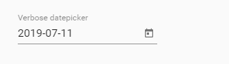
<mat-form-field> <input matInput [matDatepicker]="dp" placeholder="Verbose datepicker" [formControl]="date"> <mat-datepicker-toggle matSuffix [for]="dp"></mat-datepicker-toggle> <mat-datepicker #dp></mat-datepicker> </mat-form-field> |
ts中的修改
我们在ts中要做些调整,例如我们要实现 2019-11-15的效果!
只需修改
|
1 2 3 4 5 6 7 8 9 10 11 |
export const MY_FORMATS = { parse: { dateInput: 'YYYY-MM-DD', // 表示input中输入的格式,moment将按此格式解析内容 }, display: { dateInput: 'YYYY-MM-DD', // 显示格式,monent将日期按此格式呈现给用户 monthYearLabel: 'MMM YYYY', dateA11yLabel: 'LL', monthYearA11yLabel: 'MMMM YYYY', }, }; |
效果如下:
ts代码我贴上来
|
1 2 3 4 5 6 7 8 9 10 11 12 13 14 15 16 17 18 19 20 21 22 23 24 25 26 27 28 29 30 31 32 33 34 35 36 37 38 39 40 41 42 43 44 45 46 47 48 49 50 |
import {Component} from '@angular/core'; import {FormControl} from '@angular/forms'; import {MomentDateAdapter, MAT_MOMENT_DATE_ADAPTER_OPTIONS} from '@angular/material-moment-adapter'; import {DateAdapter, MAT_DATE_FORMATS, MAT_DATE_LOCALE} from '@angular/material/core'; // Depending on whether rollup is used, moment needs to be imported differently. // Since Moment.js doesn't have a default export, we normally need to import using the `* as` // syntax. However, rollup creates a synthetic default module and we thus need to import it using // the `default as` syntax. import * as _moment from 'moment'; // tslint:disable-next-line:no-duplicate-imports import {default as _rollupMoment} from 'moment'; const moment = _rollupMoment || _moment; // See the Moment.js docs for the meaning of these formats: // https://momentjs.com/docs/#/displaying/format/ export const MY_FORMATS = { parse: { dateInput: 'YYYY-MM-DD', // 表示input中输入的格式,moment将按此格式解析内容 }, display: { dateInput: 'YYYY-MM-DD', // 显示格式,monent将日期按此格式呈现给用户 monthYearLabel: 'MMM YYYY', dateA11yLabel: 'LL', monthYearA11yLabel: 'MMMM YYYY', }, }; /** @title Datepicker with custom formats */ @Component({ selector: 'datepicker-formats-example', templateUrl: 'datepicker-formats-example.html', styleUrls: ['datepicker-formats-example.css'], providers: [ // `MomentDateAdapter` can be automatically provided by importing `MomentDateModule` in your // application's root module. We provide it at the component level here, due to limitations of // our example generation script. { provide: DateAdapter, useClass: MomentDateAdapter, deps: [MAT_DATE_LOCALE, MAT_MOMENT_DATE_ADAPTER_OPTIONS] }, {provide: MAT_DATE_FORMATS, useValue: MY_FORMATS}, ], }) export class DatepickerFormatsExample { date = new FormControl(moment()); } |
ts中获取这个格式的时间
如何让我们输入的数据,及时在ts中获取呢?
我们使用(input)和 (change) 事件,也就是dateInput和dateChange会在我们选择时间后,出发这个事件并调用里面的函数:
|
1 2 3 4 5 6 7 8 9 10 |
<mat-form-field> <input matInput [matDatepicker]="picker" placeholder="Input & change events" (dateInput)="addEvent('input', $event)" (dateChange)="addEvent('change', $event)"> <mat-datepicker-toggle matSuffix [for]="picker"></mat-datepicker-toggle> <mat-datepicker #picker></mat-datepicker> </mat-form-field> <div class="example-events"> <div *ngFor="let e of events">{{e}}</div> </div> |
ts文件
|
1 2 3 4 5 6 7 8 9 10 11 12 13 14 15 |
import {Component} from '@angular/core'; import {MatDatepickerInputEvent} from '@angular/material/datepicker'; /** @title Datepicker input and change events */ @Component({ selector: 'datepicker-events-example', templateUrl: 'datepicker-events-example.html', styleUrls: ['datepicker-events-example.css'], }) export class DatepickerEventsExample { addEvent(type: string, event: MatDatepickerInputEvent<Date>) { console.log(moment(`${event.value}`).format('YYYY-MM-DD')); } } |
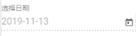
禁用input编辑
我并不希望,有些人乱搞,所以我不让他们随意在input中输入,只能通过选择时间来完成。
|
1 2 3 |
<input matInput [matDatepicker]="picker" placeholder="选择日期" [formControl]="date" (dateInput)="addEvent(xid, $event)" (dateChange)="addEvent(xid, $event)" > <mat-datepicker-toggle matSuffix [for]="picker"> </mat-datepicker-toggle> <mat-datepicker touchUi #picker disabled="false"> </mat-datepicker> |
我们在mat-datepicker中加入了disabled=”false”
官方默认在<input matInput 中加入了disabled。(<input matInput [matDatepicker]=”dp3″ placeholder=”Input disabled” disabled>)
但因为我们使用了 [formControl]=”date” ,所以不能在<input matInput 中加入disabled了。那该怎么办呢?
直接在ts中修改代码在new FormControl中加入disabled: true即可。
|
1 2 3 |
export class ProductAddComponent implements OnInit { date = new FormControl({value: moment(),disabled: true}); |
效果如下: